SAKURA Packagedesign
 商品企画から約1年かかりましたが、完成しました。
Hi there!
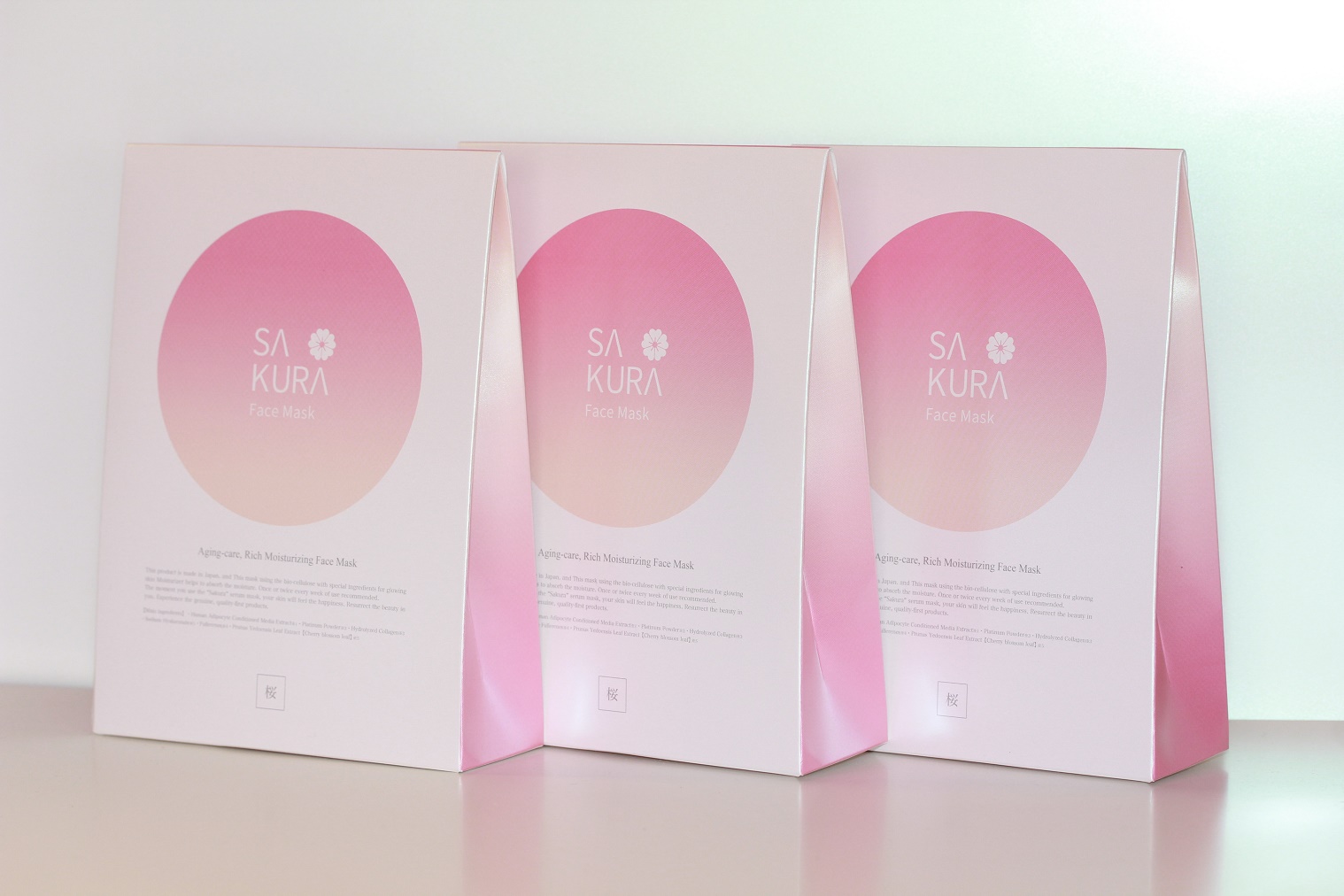
We are finally done with the SAKURAMASK package design!
It had been almost one year since the beginning of this project.
On the picture,the logo design is imaged “pureness” “innocence” “freshness” and the pink gradation color expresses about “cleanliness”and “freshness”.
The letter “A” of “SAKURA”logo on the package, it’s imagined about “Mt.Fuji” that is the biggest mountain in Japan.and the little sakura picture where place at next to Mt.Fuji, it’s designed like as a “KAMON”that is Japanese family emblem.so that is SAKURAMASK’s emblem!!
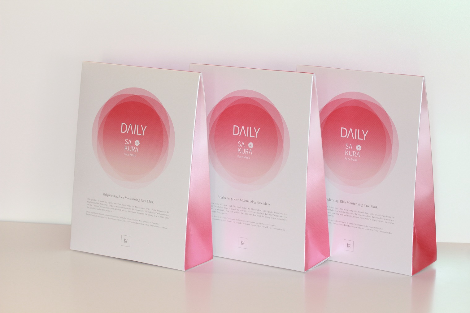
The DAILY SAKURAMASK package,there’s 4 kinds of pink gradations.It express about your skin would be beautiful day by day by using Sakuramask everyday!!!!
We really love to help your beauty!!!!